
The funny thing about beautiful signs is that you don’t notice them. From the beginning, that was our goal for museum signage at the newly renovated Gibbes. To create an aesthetic that would be elegant and inspired. Tasteful and timeless. Helpful but not distracting. We wanted to create signage that would give just enough information to guide visitors, but plenty of pause to keep the focus on the more important backdrop, i.e., the historic century-old Beaux-Arts museum and the breathtaking exhibition galleries.
And so, six months ago we set out to create beautiful signs. Over 275 signs, to be precise. My role was to determine the list of signage needs, develop a lineup of options, gather the Gibbes team to collect input, work closely with our signage fabricator, create mock-ups to test in the actual space, establish a calendar to keep signage projects on task, upload files to the printer, review proofs, troubleshoot problems, and oversee the final installation. It all had to happen before the Grand Reopening of the Gibbes on May 28th. Which meant the months, weeks, and days leading up to our target deadline would be consumed with dreams (and occasionally nightmares) about museum signage. Failing was not an option.
My journey can be summarized in a series of steps that I now offer to anyone about to embark on a signage adventure. I humbly share the following tips, sprinkled with insights that I learned along the way.
Step 1: Assemble your dream team. Mine consisted of our fearless executive director, Angela Mack, and several key staff members whom I’ll affectionately refer to as the Gibbes signage task force. The other masterminds on our dream team were the talented crew at Duncan-Parnell that fabricated our signs and spent endless hours honing every detail of production and installation.
Step 2: Get a game plan. Figure out what the signs need to accomplish, then work tirelessly with your dream team to reach a consensus. And while you’re searching for solutions, spend time looking at other museums and cultural destinations to inform what you do (and don’t) like. Study floor plans to help understand the flow of the space and a big-picture perspective. (This will come in handy when you’re later tasked with creating a visitor map for the museum.) Talk it out, but more importantly, walk it out. Walk-throughs are key at this stage. They can also be challenging when you are determining signage for a space that is essentially a construction zone. (More of that in Step 7.)
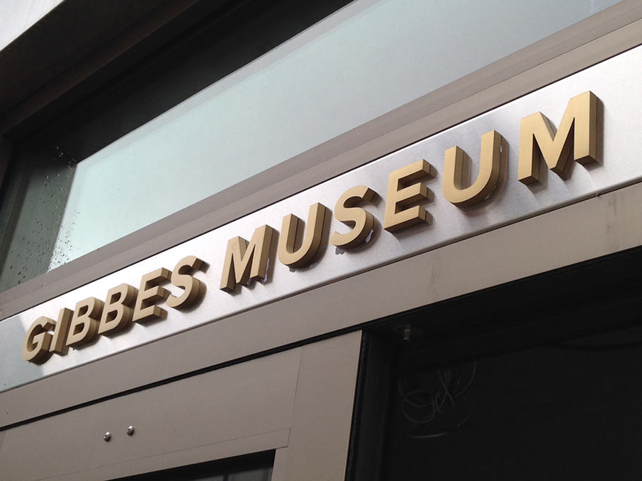
Step 3: Find your font. Then stick with it, at least most of the time. Signage is the most tactile visual of your brand identity. So make it match your brand. Our Days of Signage coincided with the launch of the new Gibbes logo that was created by local brand-master Gil Shuler in collaboration with the Blue Ion power team. It also coincided with the rebranding of our print materials and the redesign of our exhibition wall labels and text panels (which luckily fall under my domain). So it was only natural for the museum signage to adopt a consistent visual makeover. Proxima became the signature font for all Gibbes signage, and set the tone for a clean, modern, san serif aesthetic.
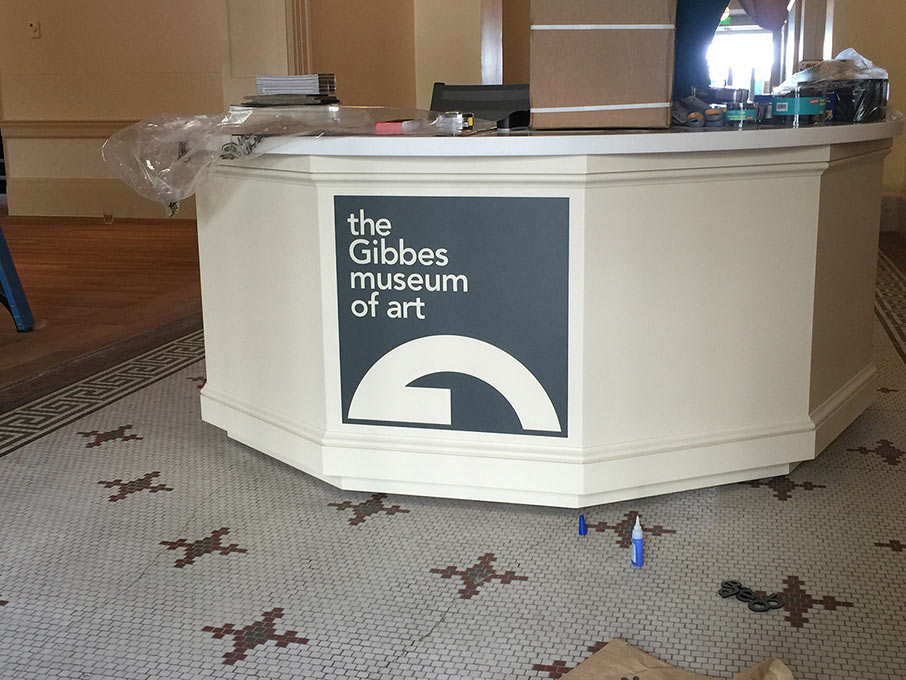
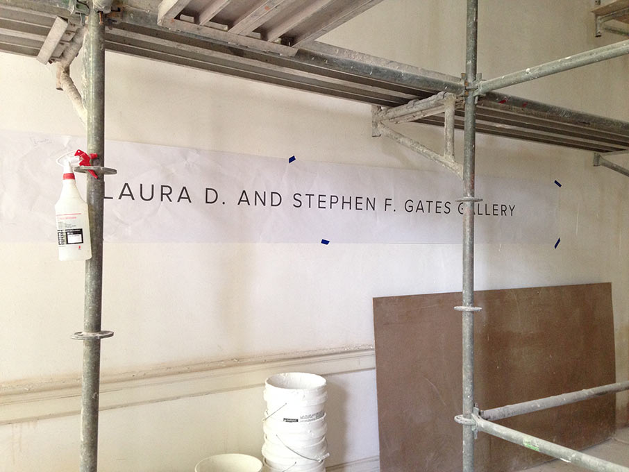
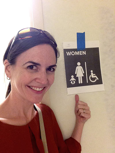
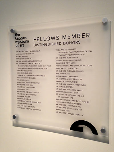
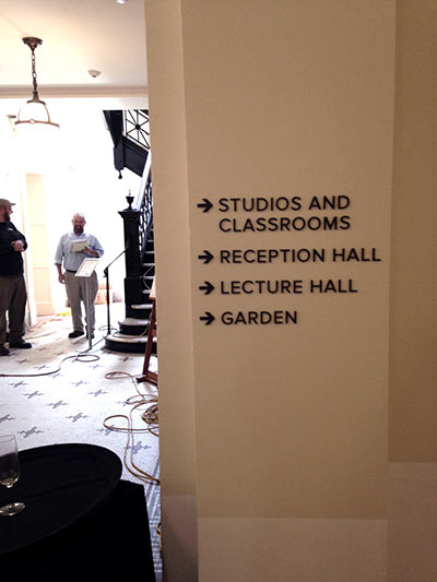
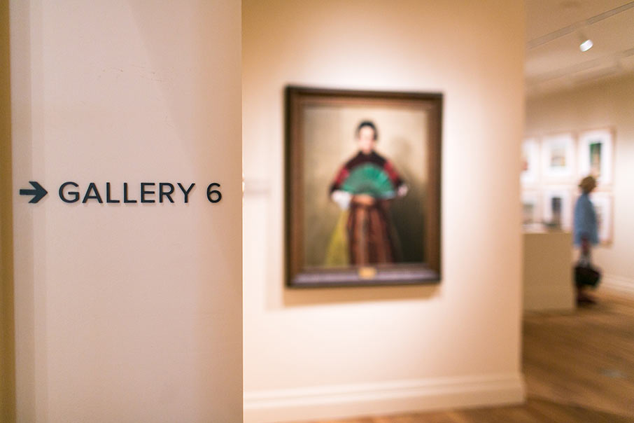
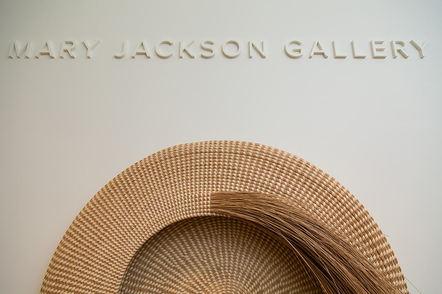
Step 4: Not all signs are equal. Some are more important than others, and it’s your job to help visitors understand the difference. In the case of the Gibbes, we assigned categories for 1) donor names 2) functional/directional and 3) ADA (with and without Braille). We wanted an elegant approach to donor names, so we chose thick routed letters that would be color-matched to the wall color, which would make the letters read as deep shadows on the wall. (Insider tip: know your paint colors!) Meanwhile, we fell in love with battleship grey, and opted to create all functional signs using the same dark tone. We carried the theme of routed letters for directional signage, using battleship grey for consistency and legibility. The same color palette and font would be used in our ADA signs (restroom, elevator, mechanical room, etc), using simple square shapes that would mimic the Gibbes logo and allow room for Braille. Every detail had to be thoughtfully considered; for example, ensuring the thickness of the raised routed letters would not be easily bumped by visitors; and including baby-changing icons on both men’s and women’s restroom signs. (Shout-out for gender equality museums!)
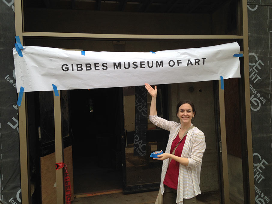
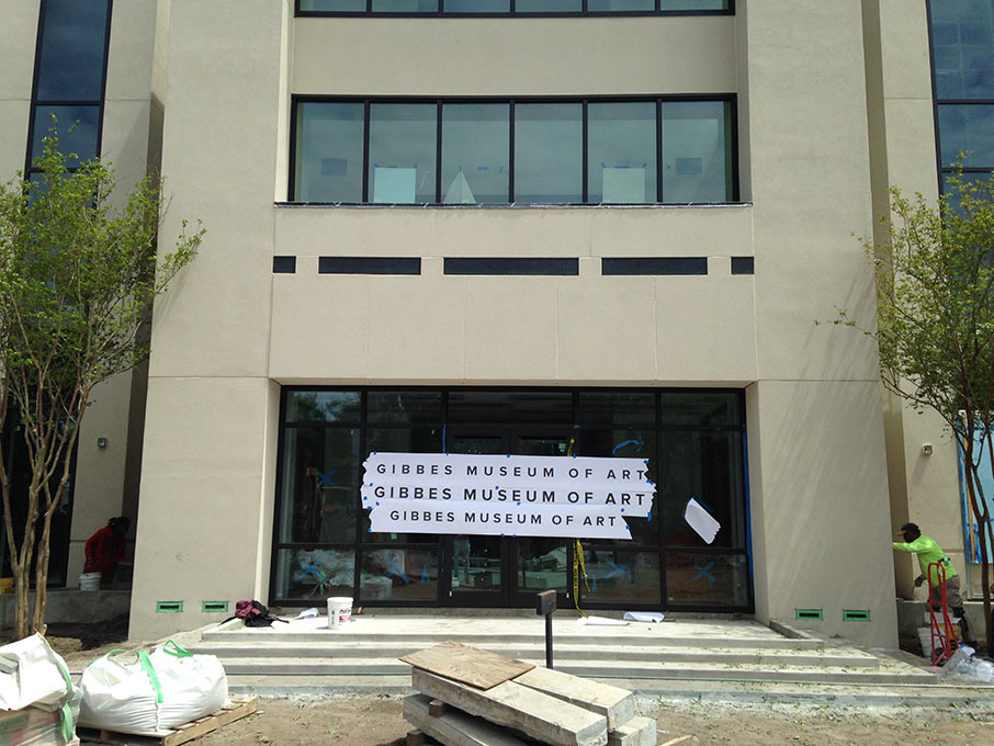
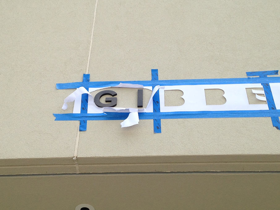
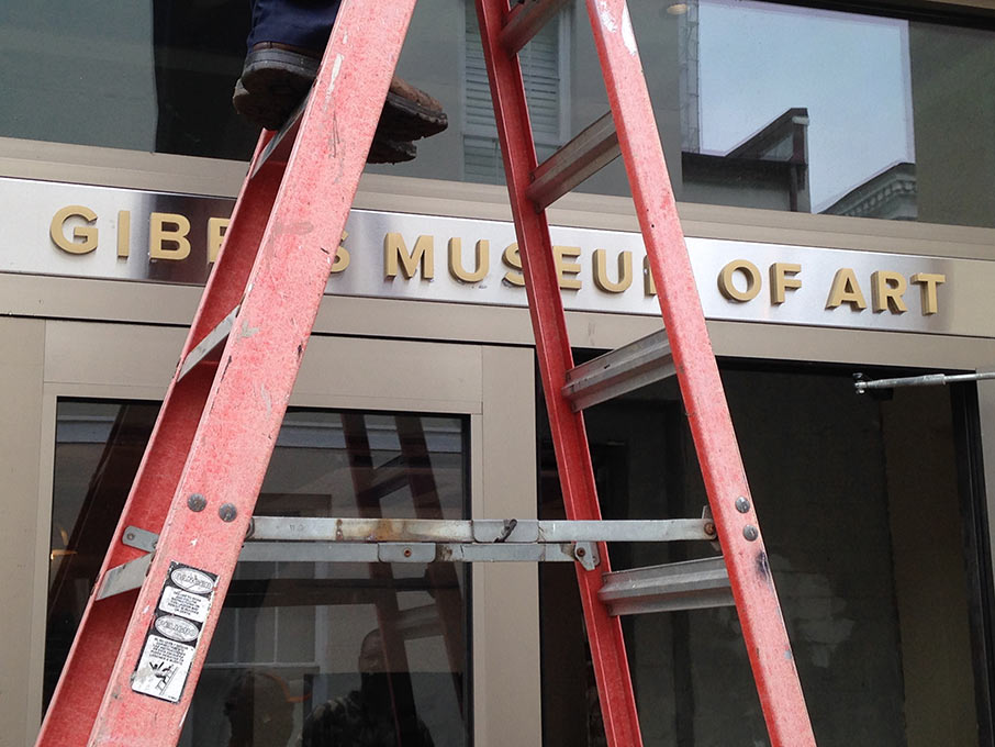
Step 5: Mock it up. And get samples, lots of samples. There’s no better way than by trial and error. So we printed rolls of signage examples testing various font sizes and spacing. It was important to establish a template for each type of sign that would be versatile enough to accommodate different words. And most importantly, it all needed to fit the space appropriately. Which meant lots of measuring and taping up test signs throughout the process. This is also a sure-fire way to get honest reactions. And in several cases it proved beneficial; for example, the architect alerting us that a donor name would not fit the staircase due to a special railing; or a construction worker mentioning that a bathroom sign needed to be handicap accessible; or the project manager informing us that wood paneling would be added to doorframes that might affect the space allocated for signs. We even had landscape workers giving their two cents about the font size of the exterior Gibbes sign above the back entrance.
Step 6: Map out your timeline. Create your calendar, work backwards, and leave lots of room for finessing. Some signs take longer to make than others. (Ahem, plaques. Lesson learned.) And some signs won’t be ready until the last minute. (Read: donor panels.) And some signs can’t be installed until the eleventh hour. (The paint must dry first. Literally.) So you must consider everything. And you must add in some wiggle room.
Step 7: Don’t mind the construction crew. And don’t wear heels. Unless you’re our fearless leader, who is somehow able to navigate scaffolding without compromising an ounce of style. The rest of us wear flats, occasionally stepping in wet plaster, and always leaving the premises covered in a film of dust particles and paint. So you must go into the space with determination, focus, and the willingness to get a little dirty. And you must use your imagination to understand the flow of the construction zone otherwise known as a museum, which at any given moment might have entire galleries locked off for painting or flooring or banister assemblage. So be kind to the construction team. Because they have the power to rescue you when you sneak into the third floor to take measurements, but get trapped in a stairwell that is being spray-painted.
Step 8: Set it in motion. Once you’ve created your list and agreed upon your template, the rest is easy (wink). You just need to design it all, send it to the printer with your wish list of specs, allow time for production, and schedule the installer. The tricky part is doing this for over 275 signs that all must come together within the same 2–3 weeks. And while it’s tempting to be fully consumed by signage, you must also carve out some time to re-design exhibition wall labels and text panels for the permanent collection and two special exhibitions. (Thankfully this part is much easier when you’re working with the rockstar curator duo at the Gibbes.) And don’t forget that the Reopening Season is also the month of celebratory events including the Street Party, the Lenhardt Garden opening, the Fellows luncheon, and the finale Ribbon-Cutting ceremony—all of which need their own special batch of signs and invitations. All with the same looming deadline. (Insider tip: sleep is mostly optional.)
Step 9: Be nice to your installer. Better yet, put him on speed dial. Because none of your planning and designing matters until the final signs are installed. He is your unsung hero, especially if he knows how to roll with the punches. We were lucky to have one dedicated installer on call from Duncan-Parnell, who was able to install all of the museum signage with an eye for perfection.
Step 10: Enjoy. When the deadline comes (and it always does), the adrenaline high will inevitably wear off. The rush of the all-nighters leading up to that momentous day will fade into a foggy memory of signage pressure. So you must take a few minutes when it is all over (okay, full confession, it’s never quite fully over) to walk through the space. Try not to stare too closely (although you know you’ll never look at another restroom sign objectively). But just let yourself breathe in the museum with the subtle periphery of signs guiding you along the way.
Because beautiful signs should not be noticeable. They should slip away into the experience without ever knowing they were so painstakingly crafted. They should point the viewer into the galleries and towards the artwork. They should whisper little bits of encouragement. And if you’ve done your job (which you hope is the case), they should not be noticeable. But they should always be beautiful.
Namaste.
—Erin Banks, Creative Director, Gibbes Museum of Art
Published July 7, 2016