This week, the Gibbes launched a brand new website. Our previous site debuted in 2007 and was built using technology that is hardly supported by today’s browsers. It definitely did not work well on smartphones, tablets, or other personal devices that proliferate today. The content on our old site was well written and engaging, but difficult to find. Now (we hope) all that has changed.
A little over two years ago, we selected Blue Ion and Gil Shuler Graphic Design to rebrand the Museum and build a new website. A committee of board members and staff worked together with the BI team to develop our manifesto which became the basis for all decisions regarding the new logo, brand, and website that ensued. With the skilled counsel of Robert Prioleau and the deft writing ability of Jenny Badman, we were able to filter and consolidate our ideas into a thoughtful statement that conveys the heart and soul of the Gibbes—the “why” we do what we do.
Once the manifesto was in place, Gil Shuler and his team took on the challenging task of converting the words into a visual brand. Gil turned to our iconic rotunda as a symbol that could represent both the history of the building—a stunning example of Beaux Arts architecture—and the place we hope to become, where an ever-changing hive of activity takes place under the dome. A streamlined G, turned on its side to mimic the curve of the dome, was selected as our new mark.

With the manifesto confirming our intentions, and the visual design of the brand setting the tone of our new look, Blue Ion’s web team began the task of creating design boards that would continue the theme online. Together, we mapped out a wireframe to clarify the structure of the new site, and then the Gibbes staff got to work drafting the content. BI’s Lauren Cook was our fearless leader who helped us navigate the ins and out of developer-speak and coding possibilities, and again Jenny Badman stepped in to help craft our information into language that was both inviting and informative.
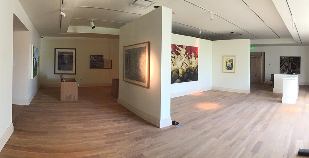
The new building offers so many possibilities, from our first floor studios that will host our visiting artists and hands-on art classes, to our gorgeous new galleries with a 30% increase in available square footage. The hardest part of designing the new site for the Gibbes staff was deciding how to present all of the new opportunities. We worked hard to simplify and streamline our content, and based on user testing and analytics research, we tried to organize the information into categories that would be intuitive and easy to find. Hopefully we have succeeded, and time will tell.

Of course there are many more items on our wish list of additions and improvements to the site, and we will continue to work on it over time. We would love to hear your reactions. Please leave a comment below, or send me an email at [email protected]. And don’t forget to join us on May 28 for the Grand Reopening of the Museum—we look forward to seeing you there.
—Lasley Steever, Director of Programs & Digital Engagement, Gibbes Museum of Art
Additional thanks: Our new site would not be so beautiful without the sharp design eye of David Wood and Nic Lauretano; and the user experience is incredibly pleasant thanks to the coding finesse of Jason Gillespie and Brian Dadin. We are grateful to all team members who helped us pull off this fantastic feat.
Published May 6, 2016

